
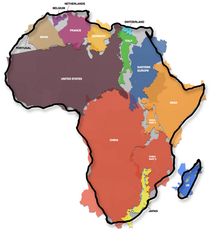

Our world is an amazing place. However, our view of it isn’t always terribly accurate. In fact, the maps that we use often work to reinforce our misconceptions. For example, the size of Europe is often distorted. It appears larger than it really is, while other countries and continents are greatly reduced in size. Once place that is often skewed is Africa; it generally appears much smaller on maps than it is in real life. So here is the true size of Africa, distortion-free.
The artist who created the graphic, Kai Krause, says that this is an image that is made to illustrate just how big Africa is without the very common map distortion known as “the Mercator projection.” If you don’t know, the Mercator projection is a tool that was invented for the purposes of navigation. It utilizes what it known as “cylindrical map projection.” Really, it is just a map. It is rectangular, and the lines of latitude and longitude are all parallel. However, it is useful because the straight lines that appear on the Mercator projection are loxodromes or rhumb lines. This means that they represent constant compass bearing. Thus, it is terribly useful for navigators because, if they want to travel from the United States to France, they just have to draw a line between the two points and the navigator knows which compass direction to continually sail towards in order to reach the destination
The Mercator map has always been a poor projection for a world map because it represents directions for navigation, not realistic representations of size. However, due to its rectangular grid and shape, geographically illiterate publishers found it useful for wall maps, text book maps, atlas maps, newspapers maps…pretty much any kind of map. In fact, the world map that you see on the nightly news is likely a Mercator projection.
If you don’t see why the Mercator projection is a problem, it gives a kind of advantage to colonial powers by making Europe look a lot larger than it actually is on the globe. As Kraus notes, “the basic fact is that a three-dimensional sphere being shown as a single two-dimensional flat image will always be subject to a conversion loss: something has to give…That ability to use lines instead of curves came at a cost: areas near the poles would be greatly exaggerated. Greenland looks deceivingly as if it were the size of all of South America for instance.”
Because of the Mercator projection, the size of Africa is often hugely underestimated, says Krause, typically off by factor of two or three. In 1989, seven North American professional geographic organizations adopted a resolution that called for a ban on all rectangular coordinate maps. However, such resolutions are often painfully slow to take hold. Their resolution reads:
WHEREAS, the earth is round with a coordinate system composed entirely of circles, and
WHEREAS, flat world maps are more useful than globe maps, but flattening the globe surface necessarily greatly changes the appearance of Earth’s features and coordinate systems, and
WHEREAS, world maps have a powerful and lasting effect on peoples’ impressions of the shapes and sizes of lands and seas, their arrangement, and the nature of the coordinate system, and
WHEREAS, frequently seeing a greatly distorted map tends to make it “look right,”
THEREFORE, we strongly urge book and map publishers, the media and government agencies to cease using rectangular world maps for general purposes or artistic displays. Such maps promote serious, erroneous conceptions by severely distorting large sections of the world, by showing the round Earth as having straight edges and sharp corners, by representing most distances and direct routes incorrectly, and by portraying the circular coordinate system as a squared grid. The most widely displayed rectangular world map is the Mercator (in fact a navigational diagram devised for nautical charts), but other rectangular world maps proposed as replacements for the Mercator also display a greatly distorted image of the spherical Earth.
So take a moment to get to know the real Africa. Click here for a larger version here (also shown below).

The Economist has their own version of the map. They decided to rework Krause’s map using Gall’s Stereographic Cylindrical Projection (1855). It is noted that this is constituted by two standard parallels at 45°N and 45°S. Distortions are still evident at the poles, but for the most part, the country’s shape is maintained, and their areas are shown correctly. As you can see (below), the results are distinct from Krause’s map. But however you look at it, and whatever map you use, Africa is much bigger than it looks on most maps.
