
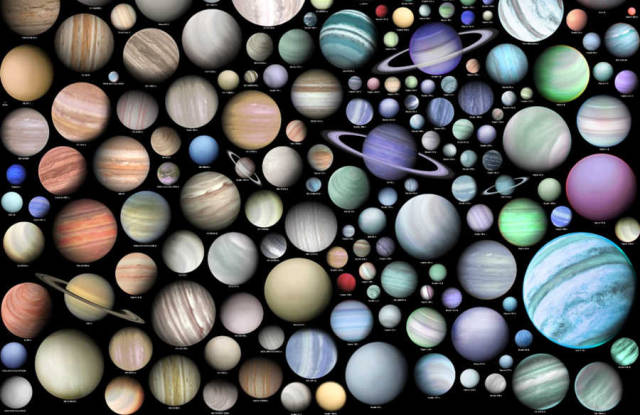
Here’s a great new poster showing over 500 extrasolar planets (about one quarter of the total) that have been discovered since 1988. This visualization, created by graphic artist and writer Martin Vargic from Slovakia, is based on the estimated radius and temperature of the planets, however other factors, such as density, age or stellar metallicity were also taken into consideration. All the various known classes of exoplanets are shown on the graphic, such as super-Earths, hot Jupiters, hot Neptunes, water worlds, gas dwarfs and superdense diamond planets.
Click on the image for a larger version, or a gigantic version here.
According to NASA’s Exoplanet Archive website, 1,903 extra solar have been discovered since 1988 as of October 22, 2015.
You may have already seen Vargic’s very cool Map of the Internet, and of special interest to UT readers a map of how the the constellations have changed over time and visualization of the Moon replaced with other bodies, as well as a wide variety of other maps and infographics. You can check out his work on his website, Halcyon Maps. He puts out new graphics each week.
There are lots of ways to plot exoplanets. On the Exoplanet Archive website, you can see plots for exoplanet mass vs. period, temperature, number of exoplanets discovered by year (2014 was a banner year), as well as how the planets were discovered (radial velocity, microlensing, timing variations and orbital brightness modulation).
Previously, we’ve featured other exoplanet visualizations, such as one of Kepler’s transiting exoplanets and exoplanet candidates, plus this cool video visualization of the planetary systems discovered by Kepler that have more than one transiting object, created by Daniel Fabrycky from the Kepler spacecraft science team:

Provided by Nancy Atkinson at Universe Today.