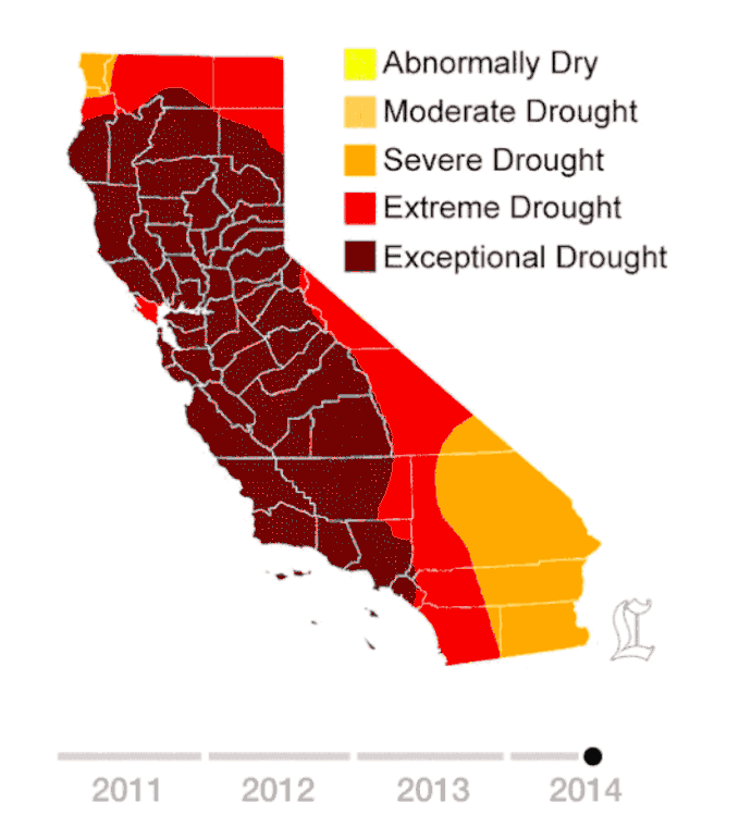
If you aren’t aware of the severe drought that California is experiencing, this GIF will make you painfully aware of it.
The numbers, when you read them, are sobering enough. The most up-to-date data indicates that at least 80% of the state is in “extreme drought,” while other portions of the state are listed as experiencing “exceptional drought” (which, if you look at the charts, is the highest level of severity). This GIF shows us just how significant the numbers are; the visualization captures something that words alone cannot— helping to underscore how dramatic (and traumatic) these figures really are…

This GIF was created by L.A. Times reader Alvaro Valiño. In the animation, each frame represents the weekly drought conditions in California. All in all, there are some 200 snapshots of the drought conditions in the state. By splicing these scenes together, we get a week-to-week visualization of the condition as it worsens. The animation starts in 2011, which was when this all really began — it was the last time California’s drought map was clear.
The data was taken from recordings from the U.S. Drought Monitor.

And unfortunately, according to the U.S. Drought Monitor, conditions in California are not projected to improve any time soon. For comparison, here is the rest of the country (notice that California sticks out like a bright blister on the map):
See more infographics here.