Our solar system is a pretty astounding place, but sometimes it is hard to really grasp it. So Here are 5 of the best images that help you conceptualize our little corner of the cosmos…
This first image comes to you from NASA/JPL; It states basic facts and characteristics about the various bodies that make up our solar system. It has a bunch of interesting information, like how long it takes each planet to rotate on its axis, how far they are from the Sun, etc. The infographic also shows the relative sizes of the planets compared to the Sun.
Want another way to visualize our solar system? Scroll on down…

The second image is another way to conceptualize our little corner of the cosmos. This image shows all the planets formally recognized by the International Astronomical Union (IAU), in addition to various dwarf planets (including Pluto, which was reclassified as a dwarf planet in 2006 by the IAU).
This new system of classification was meant to help us better identify various objects in our solar system beyond terrestrial planets, moons and gas giants; however, as I am sure many of you are aware, the demotion of little Pluto was met with controversy on a number of fronts.

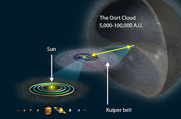
The following two images help us better understand just how vast our solar system truly is. Of course, we know that the Sun is enormous—much larger and far more massive than all of the planets in our solar system combined—but what does this really mean? Well, for starters, it means that it has a great sphere of influence. The first image shows how far this influence really extends. At the far left of the image we see the Sun: our bright beacon in the dark cosmos.

On the far right, we see the Oort cloud. At just over 11 trillion miles from the solar surface, the hypothesized dense cloud is at the outer boundary of the Sun’s influence. This portion of our neighborhood is nearly a quarter of the distance to Proxima Centauri, the nearest star to the Sun (which gives you some idea of just how far the Sun’s influence extends). The second image gives you another way to conceive of the Oort cloud.
The huge shell offers another perspective of just how far our solar system extends.

This final image gives you an idea of how close we are to our nearest neighbors. In short, it is a diagram of the Sun’s neighborhood.
While stars situated around 6 or 7 light-years from Earth seem nearby, they aren’t.. at least not traditionally. It would take light, which travels at 186,000 miles (300,000 kilometers) per second, a full year to cover just one light-year of spacetime—around 6 trillion miles (9 trillion kilometers). So these stars are very, very far away.
So far, it would take Voyager 1 80,000 years to make a one-way trip to the Alpha Centauri system.

Note that Proxima Centauri was actually discovered in 1915, but its distance was not measured until 1917.