
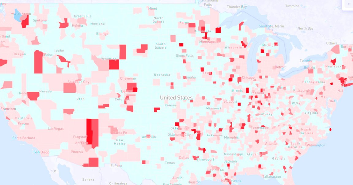
Facebook just launched a heatmap of the entire United States that illustrates the severity of the coronavirus outbreak within each individual county.
The map doesn’t necessarily reflect the actual number of confirmed COVID-19 cases in each area — that number that would be inaccurate anyway given how hard it still is to get tested in many places. Rather, it shows how the proportion of people who self-reported coronavirus-like symptoms in an online survey run out of Carnegie Mellon University.
“I think providing aggregate data to governments and health officials is one of the most important tools tech companies can provide to help respond to COVID,” Facebook CEO Mark Zuckerberg told Axios.
“Since experiencing symptoms is a precursor to going to the hospital or becoming more seriously ill,” Zuckerberg added, “these maps could be an important tool for governments and public health officials to make decisions on how to allocate scarce resources like ventilators and PPE, and eventually when it’s safe to start reopening society.”
The map itself doesn’t rely on Facebook data, and Facebook researchers supposedly can’t see individual responses. But the social media platform did prominently display the survey to users in hopes of attracting more responses and building a more comprehensive tool.
“By distributing surveys to large numbers of people whose identities we know, we can quickly generate enough signal to correct for biases and ensure sampling is done properly,” Zuckerberg wrote in a Washington Post op-ed about the project.
Moving forward, Facebook hopes to expand to a map of the entire global pandemic.
“We’re hopeful that this will help governments and public health officials around the world who might not otherwise have this kind of precise data to make decisions in the weeks and months ahead,” Zuckerberg wrote.