Readers of Futurism: Hi! If you’re here, that means you either swiped on our clever-ass push alert (HA! GOTCHA!) or you’re really, really interested in a media company’s inner-workings.
Either way, thank you, and congrats – because you got to this very special webpage, where we’re going to go over three important things with you, our dear, beloved readers:
1. Our new app is here. Download it, or update it. Because…
2. It’s great. It’s got some wonderful new features (including an offline mode), and contains a peek into what’s to come from us. Oh, and also…
3. There’s some good thought behind it. Rather than roll out another new app design (which, no matter how great, can be disruptive to readers’ familiarity with a publication and user experience, generally), and do so absent context, we wanted to let you in, under the hood, to let you know why we did what we did, and what’s on the horizon for us.
We think it’s pretty decent. You might, too.
So, without further ado, we present the two stallions who made this thing happen:

Tag Hartman-Simkins, The Artsy One (“Director of Design”)
The app redesign is part of a much larger planned redesign for Futurism, and it’s mostly dialed in on the ways we’ll be punching up on the aesthetics of the site, to go with it’s new editorial tone [Ed. You’re welcome!] and changing aesthetics: color, space, and cleanliness.
We made some fun changes. We introduced a new color palette for each of our “themes,” and they now have a fresher, brighter aesthetic. Colors! They’re colorful! We’re getting away from grayscale. No, but really: Futurism generally covers a pretty complex array of topics, even for people who consider themselves well-versed in tech publications and writing. We’re gonna be delving even further into these more obscure, complicated areas in the future, while also trying to give these stories appeal to a wider audience. It’s why I needed those concepts, visually, to code as attractively accessible to the curious, and the first step in doing that — in inviting more people to understand these topics — is by presenting them in a comfortable, visually-appealing space, as opposed to one that’s stuffy, tight, and compressed.

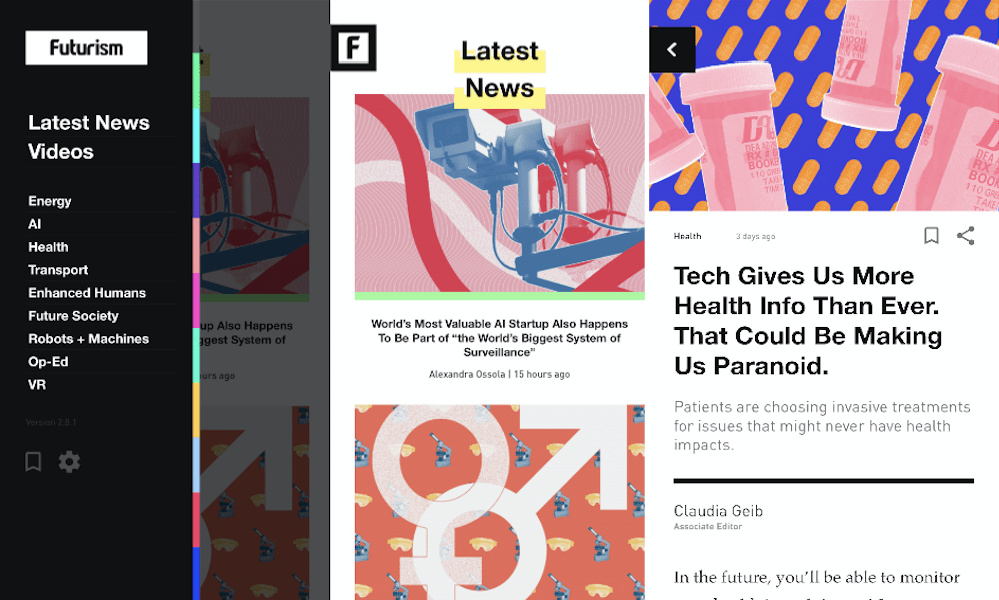
Even more: Our headers are bolder. And our articles are set in Palatino — a typeface based on humanist typefaces from the Italian renaissance – but way more legible, and set with a taller line height to make the text feel considered and valuable, rather than rushed and cheap. Instead of a drawer that pulls down from the top of the app, we drew up a left-rail drawer that can be pulled out by tapping that tab in the upper left hand corner of the screen, where users can navigate through different themes, videos and the latest news. And: Readers can now tag stories for later. In many ways, it’s just a fresh coat of paint. We’ve got plenty in mind for future iterations of the app, including further polishing and new features that enrich the user’s experience of reading and exploring Futurism, and understanding it all, too. It’s the first step, but it was still a fun step to take. We think you’ll agree.

Dan Scanlon, Lead Nerd (“Head of Engineering”)
Under the hood, Futurism’s first app was generated using a service called Appful, which integrated with our WordPress back-end, and basically loaded our content into a theme we customized with our colors. It worked as a temporary solve, but now, it’s been replaced with a new app I built from the ground up – one that suits our needs better than a plug-and-play solution.
The app was written using React Native (a cross-platform framework for writing mobile apps) and Expo (a React Native SDK that helps distribute our app, and use common platform features, like instruments and analytics).
The codebase for our new app actually builds four different apps: the iOS and Android apps for Futurism and Mostaqbal (our Arabic partner site), and the two variants share the same code. There’s no copy-pasted source code, so we don’t need to worry about keeping the variants in sync. This kind of thing’s not supported out of the box or documented anywhere on the web, so I wrote some custom tooling so we can make changes to the source, and run a single command to select the app variant we want to run to test it.
As far as user experience improvements go, again, we’re not at the mercy of Appful to change the appearance or features of the app, anymore. That means we can push important updates to the apps immediately, without submitting updates via the App Store. The “Read Later” feature has offline support, which is pretty fun, too.
And as for what’s coming down the pipeline? Like everyone else, we’re after a richer, more-polished UX — always. The challenge isn’t on the mobile end, though. It’s not that hard to build a tasty app. WordPress, really, (or an over-reliance on it) is the big dream-crusher we’d love to get out from under.
In other words: A new CMS supporting structured content. All of the things that don’t make for a perfect transfer to the app (i.e. post content rendering, video playback, infographics) are due to how the underlying information gets encoded. And: We can’t neatly lay out site posts on mobile, because it’s basically represented as HTML intended to be spit into a cup, at least as far as our WordPress theme is concerned. So instead of using native typography, image views, and so on, we have to load the HTML into a web view, and inject a bunch of CSS to make it readable on mobile. It blocks us from supporting basic features like image light-boxes (allowing users to zoom into images) and nice video playback (for videos in posts). And of course, there’s self-hosted video: If we want to have a video-heavy app, we should be serving that content ourselves, so that we can control the UX. Currently the best we can do is embed YouTube players inside of web views, which: “puke emoji.”
So, yeah, we’ve got some work ahead of us. That said, as perfectionists, we occasionally need to be reminded (and remind ourselves) that we do halfway decent work. So, fine: The new app is pretty swell. It’s, in all honesty, a huge jump over the last one. And you’re gonna love the way we look in it. I guarantee it.