Throw Back
In the rush to modernize and electrify vehicles, many automakers followed the lead of big tech companies and turned old-school interior knobs, switches, and buttons into touchscreens.
The only problem? Basically, lots of drivers hate them with a passion.
Apparently, enough customers in Europe complained to Volkswagen that the German car company is bringing back physical buttons and control switches to its new batch of cars, according to Autocar.
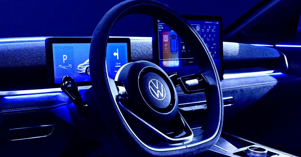
Volkswagen says future interior designs will be derived from its ID 2all concept car, an electric four-door vehicle that would cost 25,000 Euros and be sold in Europe. While it still has two screens, one for driver information and one for the infotainment system, the car features physical buttons to control it all.
Earlier this year, Volkswagen CEO Thomas Schäfer acknowledged that customers were unhappy with the vehicles’ touchscreens.
“We had frustrated customers who shouldn’t be frustrated. So we’ve spent a lot of time now – working through really systematically – on what all the functions are that a customer usually touches when using a vehicle,” he told Autocar in a June interview. “We rank them. What are the most important ones? Which ones need to go on buttons? Which one needs to go on the screen? First level, second level, third level? And where do you intuitively reach when you want to switch on the light?”
Touchy
Why do drivers hate touchscreens in vehicles so much?
Navigating a screen while you’re driving takes your eyes off the road. Plus they’re distracting, and you have to meander through various menu options to get what you want. And functions can become inaccessible if the screen dies.
And yet touchscreens have come to dominate the market, with something like 97 percent of new vehicles now sporting these gizmos.
But customers don’t necessarily like them. Consumer Reports regularly ranks cars’ infotainment systems, and surveyed drivers hate the flashy, advanced systems with touchscreens or touchpads inside luxury vehicles, while significantly preferring cheaper vehicles with simpler, easier to understand controls.
It’s plain to see. People want intuitive controls that are no brainers to use. They don’t want to shift through multiple menu options while changing lanes. That’s a recipe for disaster.
Besides Volkswagen, Rolls-Royce probably got the memo on touchscreens, and its first electric car, the Spectre, has understated interior screens and plenty of buttons and knobs that look surprisingly retro.
Hopefully, other car makers get the message: bring back physical buttons!
More on cars: Car Companies Are Suddenly Super Worried About the Future of EVs